item
Jetpack Compose
Installation
Compose - similarly to other Android Libraries - can be a bit hard to setup and understand.
Compose Compiler
Starting from Kotlin 2.0 the compose compiler is in match with the Kotlin version.
Before Kotlin 2.0
Check Compose Compatibility with Compose Koltin Compatibility Map here and set the compatible version on your app’s build.gradle
android {
    composeOptions {
        kotlinCompilerExtensionVersion = "1.5.1"
    }
}
Afer Kotlin 2.0
Once you know and have access to your kotlin version (i.e Version catalog) you can add the compose plugin to your dependencies and your build.gradle(s)
// libs.versions.toml
[plugins]
compose-compiler = { id = "org.jetbrains.kotlin.plugin.compose", version.ref = "kotlin" }

// Root build.gradle.kts
plugins {
	alias(libs.plugins.compose.compiler) apply false
}

// Android / CMP build.gradle.jts
plugins {
  	alias(libs.plugins.compose.compiler)
}
Enable Android Studio features for compose
If you’re using Android studio and want to have full access to tooling like previews, preview animations, live edit, etc you need to enable the build flag on your apps build.gradle.kts
android {
    buildFeatures {
        compose = true
    }
}
dependencies {
	implementation("androidx.compose.ui:ui-tooling-preview")
    debugImplementation("androidx.compose.ui:ui-tooling")
}
Manage Versions
Compose dependencies have different version numbers so having a “single” compose version that manages its dependencies won’t work. For this we can use a BOM (Bill of Materials) which will manage the version of the dependencies that we decide to include. You can see which version will be including looking at the BOM Library version mapping and if you want to see the Alpha or Beta releases you can see that on the MVN repository.
Usage of BOM (with version catalog/ libs.versions.toml )
// libs.versions.toml
composeBom = "2024.04.01"

androidx-compose-bom = { group = "androidx.compose", name = "compose-bom", version.ref = "composeBom" }
androidx-ui = { group = "androidx.compose.ui", name = "ui" }


// Build.gradle.kts - App
dependencies {
	androidTestImplementation(platform(libs.androidx.compose.bom)) //Android only
	implementation(libs.androidx.activity.compose)

    implementation(libs.androidx.ui)


}
Overwrite Version of a Library within BOM
// libs.version.toml
// From
androidx-ui = { group = "androidx.compose.ui", name = "ui" }
// TO
androidx-ui = { group = "androidx.compose.ui", name = "ui", version.ref = "yourVersion" }

// build.gradle.kts
dependencies {
    implementation(libs.androidx.ui)
}
Compose Libraries
For Compose Multiplatform, Google mostly develops Android-specific libraries and Jetbrains creates wrappers for them (currently there’s no BOM for Compose Multiplatform ) and many android-specific libraries are available under the org.jetbrains.androidx prefix. (You can see all libraries in MVN)
As briefly mentioned before in Compose BOM, compose is very modular and so it doesn’t include many functionalities out of the box. We will talk about different libraries once we are looking into specific topics and areas, but it’s good to know what the official libraries are and what are they used for.
Tooling
// Android Studio Preview support
    implementation("androidx.compose.ui:ui-tooling-preview")
    debugImplementation("androidx.compose.ui:ui-tooling")
User Interface
    // Material Design 3
    implementation("androidx.compose.material3:material3") // <--- Use this by default
    // or Material Design 2
    implementation("androidx.compose.material:material")
    // or skip Material Design and build directly on top of foundational components
    implementation("androidx.compose.foundation:foundation")
    // or only import the main APIs for the underlying toolkit systems,
    // such as input and measurement/layout
    implementation("androidx.compose.ui:ui")

    // Optional - Included automatically by material, only add when you need
    // the icons but not the material library (e.g. when using Material3 or a
    // custom design system based on Foundation)
    implementation("androidx.compose.material:material-icons-core")
    // Optional - Add full set of material icons
    implementation("androidx.compose.material:material-icons-extended")
    // Optional - Add window size utils
    implementation("androidx.compose.material3.adaptive:adaptive")
Android Integration
// Optional - Integration with activities
    implementation("androidx.activity:activity-compose:1.9.2")
    // Optional - Integration with ViewModels
    implementation("androidx.lifecycle:lifecycle-viewmodel-compose:2.8.5")
    // Optional - Integration with LiveData
    implementation("androidx.compose.runtime:runtime-livedata")
Use cases
Similar to React, compose is divided in two; The compose compiler and compose UI which makes compose really versatile as the runtime and compiler can be embedded on other platforms similar to ReactNative or React Three Fiber.
History
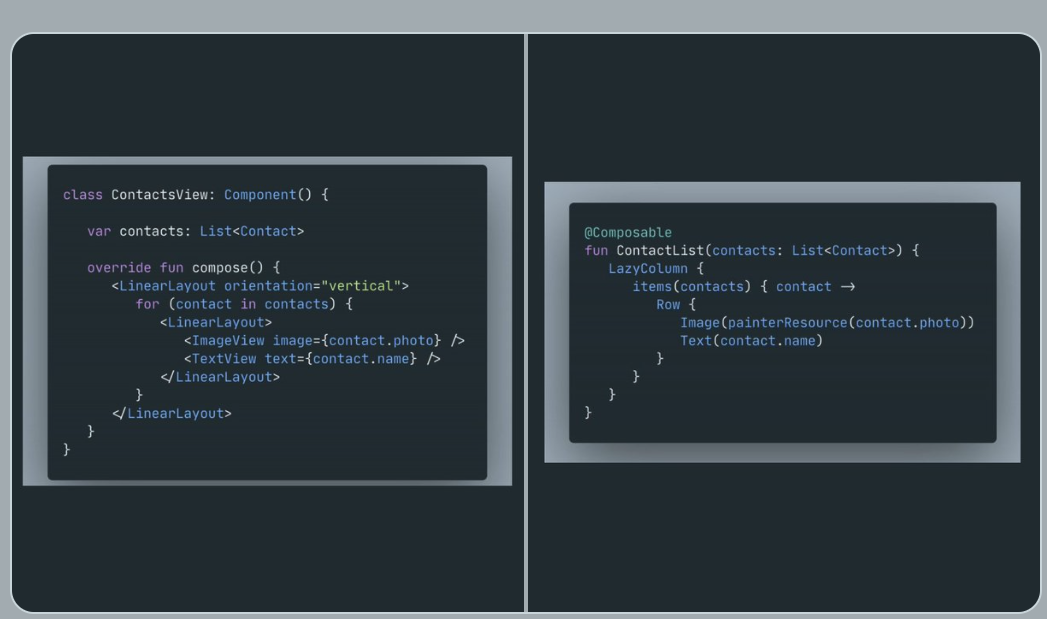
Jetpack compose started off as a way to write Declarative user interfaces by using the Android XML Views system within Kotlin code, kind of like React did with JSX in JS (which is not part of the JS programming language so it has to go trough a build tool first) But Jetbrains (the creators of Kotlin preferred to use the Kotlin’s capabilities to create DSLs instead of adding XML support.
Overview
Jetpack Compose is Android’s way to build declarative UIs with Kotlin, similar to SwiftUI on iOS Development and React on Web development. Achieving very similar results as React, in the sense that in compose each function can be a self-contained component with inputs to operate and outputs UI or state (like React Hooks).
Compose is not just UI
Basic Concepts
All of these topics are part of the compose-core library
State
State in compose is a wrapper on a value that allows compose to track its changes and re-execute `composable` functions, most of the time state needs to be marked as mutable, this can be done with `mutableStateOf` and it will wrap our value with the `State` and we will be able to access the current value of the state by using the `.value` property. This minor inconvenience can be fixed by using Kotlin delegates so it would look something like:
var name by mutableStateOf("")Since compose are functions the state is only saved when rendering, instead of a component t lifecycle
Side-Effects
An effect is a composable function that doesn’t emit UI and causes side effects to run when a composition completes.
LauchedEffect: run suspend functions in the compostable’s scope
rememberCoroutineScope: Obtain a composition-aware scope to launch a coroutine outside the composable
As LaunchedEffect is a composable function, it can only be used inside other composable functions. In order to launch a coroutine outside of a composable, but scoped so that it will be automatically canceled once it leaves the composition
rememberUpdatedState
DisposableEffect : An Effect that requires cleanup
Similar to React’s Cleanup function in useEffect you can launch an side-effect at the initial composition of the composable and a cleanup callback when the composable leaves the composition. This is specially useful for observers that you need to remove.
val currentOnStart by rememberUpdatedState(onStart)
    val currentOnStop by rememberUpdatedState(onStop)

    // If `lifecycleOwner` changes, dispose and reset the effect
    DisposableEffect(lifecycleOwner) {
        // Create an observer that triggers our remembered callbacks
        // for sending analytics events
        val observer = LifecycleEventObserver { _, event ->
            if (event == Lifecycle.Event.ON_START) {
                currentOnStart()
            } else if (event == Lifecycle.Event.ON_STOP) {
                currentOnStop()
            }
        }

        // Add the observer to the lifecycle
        lifecycleOwner.lifecycle.addObserver(observer)

        // When the effect leaves the Composition, remove the observer
        onDispose {
            lifecycleOwner.lifecycle.removeObserver(observer)
        }
    }
Composition
The composition is a Tree-structure of your composables that describe your UI. This keeps track of all the composables available on your UI.
Recomposition
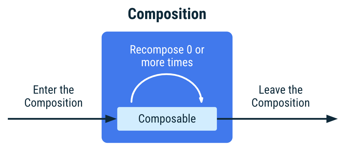
When the state of the app changes, a recomposition will be scheduled and will re-execute the composables that might have changed, then the composition is updated to reflect the changes.
Similar to React’s Virtual DOM.
The composition can only be created by initial composition and updated by recomposition.
Lifecycle
A composable lifecycle is defined by the following events:
- Initial composition
- Recompose 0 or more times
- Leaving the composition
A composable lifecycle is quite simple compared to Views or Activities. If a compostable needs to interact with those more complex lifecycles you should use Side-Effects
Phases
Styling
All of these topics are part of the compose-ui library
Basic Layouts
In compose composables are used to create portions of the UI and layouts allow you precisely arrange them. Many of the composables are in fact, layouts.
- Column / LazyColumn / FlowColumn
- Row / LazyRow / FlowRow
- Box / BoxWithConstrains
- Grid
- Spacer
Custom Layouts
Custom Layouts (Position Absolute)
Adaptive Layout
Modifiers
Resources
Animations
Material Theming
Navigation
Compose Navigation
- Supports:
- composable
- dialog
- activity
- fragments
- nested navgraphs
Nav3
- Voyager
- Decompose
- Circuit
- Adaptive Navigation
- Layout Transitions
Gestures
Animations
Accessibility
- Touch & Input
- Merge Decendants
- Roles
- Order
- Custom actions
Ecosystem
Mobile
Navigation
Official
Navigation3
Voyager
Voyager is a Programatic navigation library, similar to the iOS navigation style, where you can just call navigator.push(PostDetailsScreen(post.id)) and it will navigate to the new screen (no graph needed)
Drawbacks
- No official deeplinks
- No adaptive navigation
Voyant
An extension for voyager and the official navigation to support iOS back navigation natively
iOS
Calf
Compose-cupertino
**UI **
Charts
Vico ⭐
-
Multiplatform
-
Variable X/Y
-
Infinite scroll
-
Paginated scroll
-
Stacked bars
-
Highlight bars~
-
Legends
-
Donut
Compose Charts
A multiplatform library that provides the most common charts
YCharts
An amazing and customisable charts libray, but currently only supported on Android
Markdown renderer
A Multiplatform library to render markdown content, with support for images, links, custom styles and components.
- No Bold Support
- Issues with Image rendering
3D
Unfortunatelly Android still doesn’t have a official 3d library yet and the best option for now is to use Spline
Web
Kilua
Framework for Building full-stack applications with compose
- Focus on frontend with integartion with Tailwind and other technologies
- SSR support
- Integration with Kotlin backend libraries like Ktor and Spring
- Export to Static Site (?)
Compose HTML
Compose Web
Kobweb
Opinionated
Build Websites using Compose-html, with support for backend and frontend, as well as other utilities, it is like the Next.js of Compose
In my experience this is a great project, but for static site rendering it uses a whole browser to render the site…
Extra
CLI
Architecture
- Circuit
- Ktlint rules
Inter-op with Fragments & Views
AndroidFragment<MyFragment>()AndroidView(ViewBinding::inflate) {}
Documentation
Links
Compose theme interop with XML Colors
Displaying and Updating GeoJSON on a MapBox in Jetpack Compose
Expanding Compose Snackbars